 I’ve never really been a Jil sander cheerleader, apart from a few years when Raf Simons was at the helm, but that’s not much in an almost-50-year history for the label.
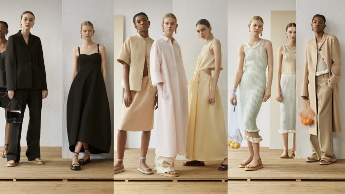
Yet I’m certainly warming to Luke and Lucie Meier’s vision for the brand. For women who reject the current maximalist trend, who love neutral tones, who like quirky plays on masculine shirting and tailoring fabrics, who like powerful silhouettes without traditional hourglass figure sexiness, there’s plenty to choose from.
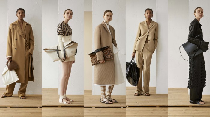
 The pre-summer 19 collection was simplicity taken to extremes but with a surprising amount of detail if you got close enough.
It was all about the everyday elevated. Think of the simplest coats and jackets were made special with curvaceous tailoring that also made the most of the subtle contrast of complementary fabrics.
 Think of layering used to both define the body and skim it. And think of dresses, cut loose and tunic-like for ultimate minimalism, making good use of strategic cutouts, or curving out to a full skirt from an almost-fitted bodice. It was all about made an impression without any real need for the beading, logos and power prints so many other designers rely on.
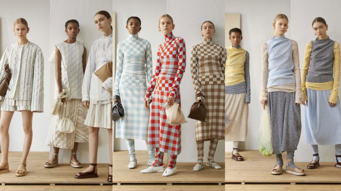 In fact, a few chequerboards aside, this was practically a print-free zone, although unfortunately it wasn’t completely logo-free. The Jil sander name plastered across the back of a black coat or on some of the collection’s bags was perhaps the least successful element in the collection. But I suppose every label feels the need for some prominent logos at the moment.

Much more appealing were the accessories – the corset belts, the ‘wrapped’ flat sandals, the flatform sandals with slightly flared soles, the statement kerchief scarves, the oversized totes or clutches, the squishy handbags, pastel toned shoppers and the occasional leopard calf hair accents. Not bad at all.