
Delpozo AW16, picture courtesy Net-a-Porter
I’m turning into something of a Delpozo groupie. The pre-fall 16 collection designed by Josep Font for the label won me over and now AW16 has blown me away. OK, it’s crazily expensive (but also understandably so given the level of detail), and it’s not exactly practical. These are uncompromising clothes for women who don’t exactly have to take a trip to the supermarket too often.
The extreme, architectural silhouettes remind me of the work of Cristobal Balenciaga or Pierre Cardin (before he went all Space Age).
But despite their limited association with the real world in which most of us live, scratch the surface and there are plenty of ideas to inspire in there, as well as the enjoyment of looking at purely beautiful clothes. Here are my four key takeaways…
One: Colour
This label has always had a deft way with colour but in a season where blacks, greys, neutrals and whites have been almost overwhelming, Font’s colour combos (whether it’s colour splashed across a top or the contrast of doubled-faced wools) feel both powerful and directional.

Delpozo by Josep Font, AW16
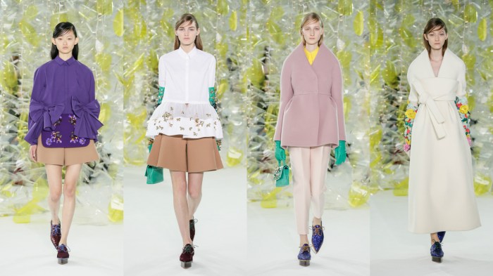
Two: Silhouette
Volume is a key direction that we’ve been seeing for pre-fall and now for AW16. Font does it with a more structured edge. But extreme though these pieces are, I could easily imagine wearing these four looks. In fact, the purple top would work a treat with a pair of jeans!

Delpozo by Josep Font, AW16
Three: Simplicity
The embellishment and other details in this collection can’t hide the fact that many of the pieces are actually extremely simple (even minimalist). Looks one and two here are essentially roomy shirts with wide shorts while the other two are the same basic jacket shape, interpreted in the finest woollens. Inspired.
Delpozo by Josep Font, AW16
Four: Riches
No Delpozo collection would be complete without some evening/occasion options. The combination of shine, sheer, print or embellishment with some surprisingly muted colour options feels rich, lush and oh so luxe.
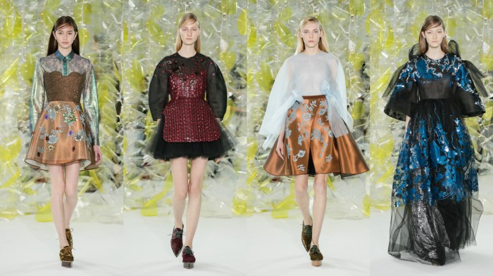
Delpozo by Josep Font, AW16


